For a long while, I’ve often had problems with creative-momentum.
Sometimes I find it very hard to get something started, and once I have managed to achieve a sense of flow to my process, I’m loathe to halt it.
I have found on many occasions that ‘life’ gets in the way of the set of images I’m currently editing. You know the stuff, commitments, an invitation to go out with friends, got to go to work, all of it was a hassle for me. Especially if I found myself at 3am in the middle of an editing session and I was loathe to go to bed because I had ‘just one more photo’ to edit.
Similarly, when I have stalled something due to commitments, I used to be worried that leaving it hanging in the air, unresolved, would somehow mean I’d lose something critical. I was terrified of not being able to pick up the threads later on, or worse still, find that the moment had passed and the passion I had felt for the work was, well, no longer there. It used to cause me a great deal of angst.
I think it all stemmed from a sense of fragility. Creating work is like a birth. But due to the many decisions that you can make (and make wrongly) the birth process is fraught with the possibility of things not reaching their full potential. It was hard for me to walk away from something I was in the middle of, hard to press ‘pause’ and then leave it for weeks while I was busy with something else. I hated it because I was always full of doubt as to whether I would like the work when I was able to return to it. Imagine finally getting back to something, only to discover it’s not as good as you had thought it was?
Then about four or five years ago, I just found I’d run out of steam. I had reached the end of a workshop year and the last thing I was wanting to do was work on any images. But I had a set of images, indeed many sets of images that I had shot that year, which were all now sitting in a pile in my home studio waiting for me to look at them, to appreciate them. I couldn’t face it.
So I did what I never do.
I parked them to one side and despite feeling that doing so, I’d never ever work on them again. I chose to put off working on them, because I’d much rather prefer to work on something when I’m feeling it than work on it when I’m not. It is perhaps the worst sin we can do as creative people: work on something when we’re not into it. It’s disrespectful, as we need to give our work the attention it deserves. I mean why bother spending $$$ and hours out in the field, if you’re going to be rushed at editing the work?
So I parked them. Some of them for months, and some were parked for a year. Others are still parked many years later.
I didn’t know when, or if I would work on these images. I just felt I needed to give them some time, and myself some space from them. Distance, as I’ve written many times before can give clarity, and also time for us to re-charge, get enthused about what we’re into.
And this is exactly what happened with some of the images about six months later. And then a year later I did it again. It was new territory for me to find out that I would still get engaged in work that I had created months, or even a year before. But I did, and I took comfort in knowing that just because I did not feel the need to work on the images straight away, it didn’t mean the work was garbage. It just meant the time was wrong. I learned that it’s best to let thing sleep if I’m not feeling it. And to just wait until the time I do feel like working.
My original fears of losing momentum on the shoot, of not remembering what it was that I was doing, or leaving the work for so long that I would have very little connection to it turned out to be false. I got into the work, but I did it when I was ready.
These days, I now have a pile of work sitting in my home studio, which I now trust myself to get around to at some point. I think that trust is the key word here. I trust myself. Because before this, I don’t think I ever did trust myself. I was too precious about my work, and felt that if I didn’t deal with it straight away, I’d loose momentum on it.
I now enjoy the fact that I have a backlog of work to work on. It means I have something saved up, something in the store. Just in case the well runs dry, or I can’t get out and shoot. I like that. It’s like being a song-writer that has a stock of songs to work on. So if there are days when I can’t come up with new melodies, I have these unfinished songs to work on.
Before I finish up today, I would like to stress that I am no procrastinator. But I do think many people are. Please don’t assume that I condone ‘putting off working at your photography’. If you are a procrastinator then I can see you easily take up my words as validation to keep on procrastinating. Today’s post is not for you.
If, however you are someone who works very hard, but gives yourself a hard time, most of the time, for not working harder, then I am glad you’ve made it this far in my post today. My message is really aimed at those that plough on regardless with their photography, and don’t stop to think that maybe they are over-worked, or not really in-touch with what they’re creating. By letting the work take a back-seat for a while, even a very long while, it may be the best thing for it.
As with anything, it’s a case of knowing when you’re in the creative zone, and when you aren’t. If you aren’t, then perhaps it’s best to sleep on the work for a few days, months or sometimes just file it away for some time in the future.


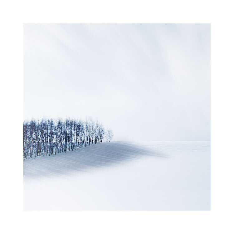
 sold out
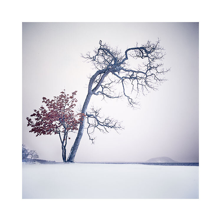


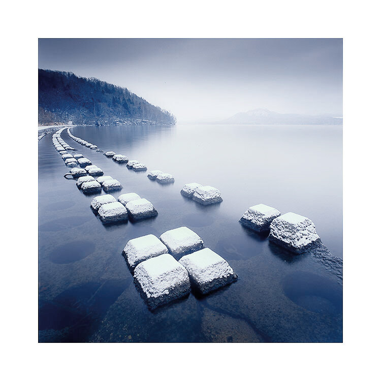
 sold out


